Key Challenges
Field experts were juggling multiple deadlines, client follow‑ups, and inspection schedules without a clear overview of their workload. Existing tools required users to switch between screens and desktop portals, leading to inefficiencies, missed deadlines, and poor visibility into key performance metrics.
- Lack of a unified overview of due dates and inspection tasks
- Difficulty monitoring performance metrics (utilization, billing efficiency)
- Fragmented navigation between core features (time entry, matters, reporting)
User Research
1. Stakeholder Interviews Spoke with claims managers and adjusters to understand reporting needs. Identified pain points around missing deadlines and low visibility into work‑in‑progress.
2. Contextual Inquiry Mapped their workflows: capturing photos, logging time, and communicating with clients.
Ideation & Information Architecture
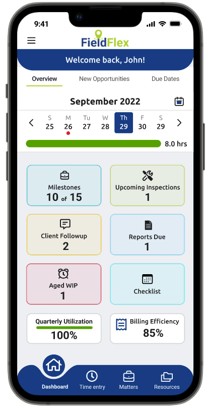
Feature Prioritization Workshop to align on top dashboard widgets:
Due Dates, New Opportunities, Upcoming Inspections, Milestones, Client Follow‑up, Aged WIP, Quarterly Utilization, Billing Efficiency.
Sitemap & User Flows created to outline entry points and navigation patterns from the dashboard to detailed modules.
Wireframes
Developed low‑fidelity sketches focusing on a clean grid layout of widgets. Iterated through three rounds of wireframes, refining the placement of the calendar header, progress bar, and key performance indicators.
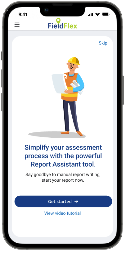
Automatic Report‑Creation Wizard
Integrating an Automatic Report‑Creation Wizard into FieldFlex delivers clear value for both your expert users and your business:
Guided, Step‑by‑Step Workflow
The wizard breaks a complex report into bite‑sized steps, lowering cognitive load and helping even first‑time users feel confident. No more hunting for the right fields, each screen focuses on one decision at a time.
Speed & Efficiency
Pre‑built templates, smart defaults and real‑time validations mean users can generate polished reports in minutes instead of hours. Faster turnarounds keep workflows moving and reduce backlogs.
Consistency & Accuracy
By enforcing standardized sections and formatting, the wizard ensures every report adheres to your organization’s style and compliance requirements. That cuts down on revisions and mitigates the risk of missing critical information.
Reduced Training & Support
A self‑explanatory wizard minimizes the need for extensive manuals or workshops. New team members ramp up quicker, and your support team fields fewer “how do I…” tickets.
Enhanced User Satisfaction
Automating repetitive writing tasks lets experts focus on what they do best, analysis and fieldwork, rather than wrestling with document structure. Happier users translate to higher adoption rates and stronger retention.
Business Impact
Faster, more accurate reports accelerate claims processing, improve client trust, and sharpen your competitive edge. Over time, the time saved on every report compounds into significant cost savings and revenue growth.
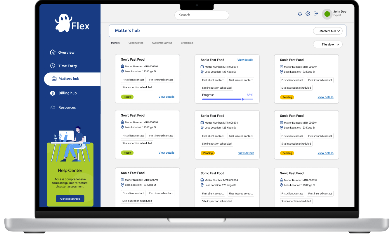
Ideation: Desktop Dashboard – Our Next Step Forward
As we continue to evolve the FieldFlex experience, our next step is to lead the shift from mobile‑only to a purpose‑built desktop dashboard, currently referred to as GhostFlex until further notice. This concept will guide us toward a more comfortable, efficient end‑of‑day review for experts at their desks:
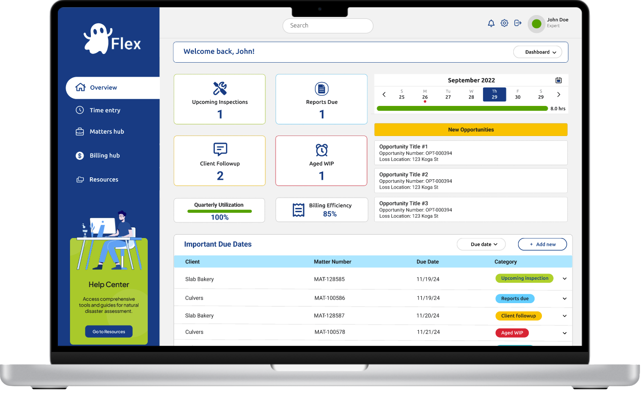
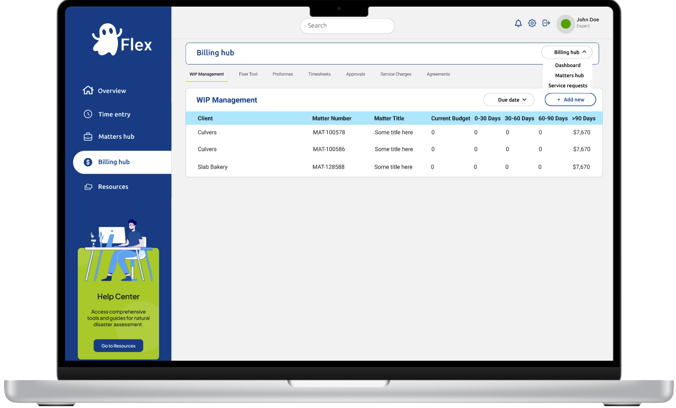
Persistent Left Navigation– Benefit: Always‑visible sections (Overview, Time Entry, Matters Hub, Billing Hub, Resources) eliminate hidden menus, reducing cognitive load and clicks compared to mobile.
Global Search & Profile Bar– Benefit: A full‑width search plus notifications, settings, and profile access in the header supports rapid context switching without hunting through nested mobile menus.
Personalized Welcome & Dashboard Switcher– Benefit: “Welcome back, John!” plus a view selector empowers users to pivot between calendar, map, and metrics, all without losing their place.
High‑Level Status Cards– Benefit: A 2×2 grid of key metrics (Inspections, Reports, Follow‑ups, Aged WIP) surfaces all critical numbers at once, replacing vertical stacks and endless scrolling on phones.
Utilization & Efficiency Metrics– Benefit: Full‑width progress bars for Quarterly Utilization and Billing Efficiency offer precise at‑a‑glance insights that would be cramped on mobile.
Interactive Week‑At‑A‑Glance Timeline– Benefit: A horizontal date slider with color‑coded daily hours makes weekly performance instantly visible, touch‑friendly and spacious on desktop.
New Opportunities Panel– Benefit: A dedicated side panel lists the latest matters with titles, numbers, and locations, staying in view as you scroll, avoiding disruptive drill‑in patterns.
Important Due Dates Table– Benefit: Sortable columns, dropdown filters, and an “Add New” action let users manage tasks in bulk, more efficient than mobile’s endless horizontal swiping.
Help Center Call‑Out
– Benefit: A distinct assist module invites experts to deep‑dive resources without obscuring core functions or competing with primary navigation.
Visual Design
Brand Alignment: Incorporated Envista Forensics’ color palette (navy blue, lime green, teal accents) for consistency.
Hierarchy & Contrast: Used colored borders to differentiate widget categories (e.g., inspections in green, WIP in red).
Typography & Iconography: Selected legible typefaces and clear icons for quick scanning in field conditions.
Final Thoughts
This future‑state vision will serve as our blueprint for prototyping, user validation, and eventual development, ensuring a desktop‑optimized experience that maximizes screen real estate, streamlines workflows, and elevates end‑of‑day productivity.

.png)