Project goals
The goal is to provide simplification and a better user experience across the Claims Connect Portal by:
- Minimizing clicks to content
- Make it easier to complete my tasks
- Hear from users to help shape the new user experience
- Minimize scrolling and possibly tabs
Learning about user needs
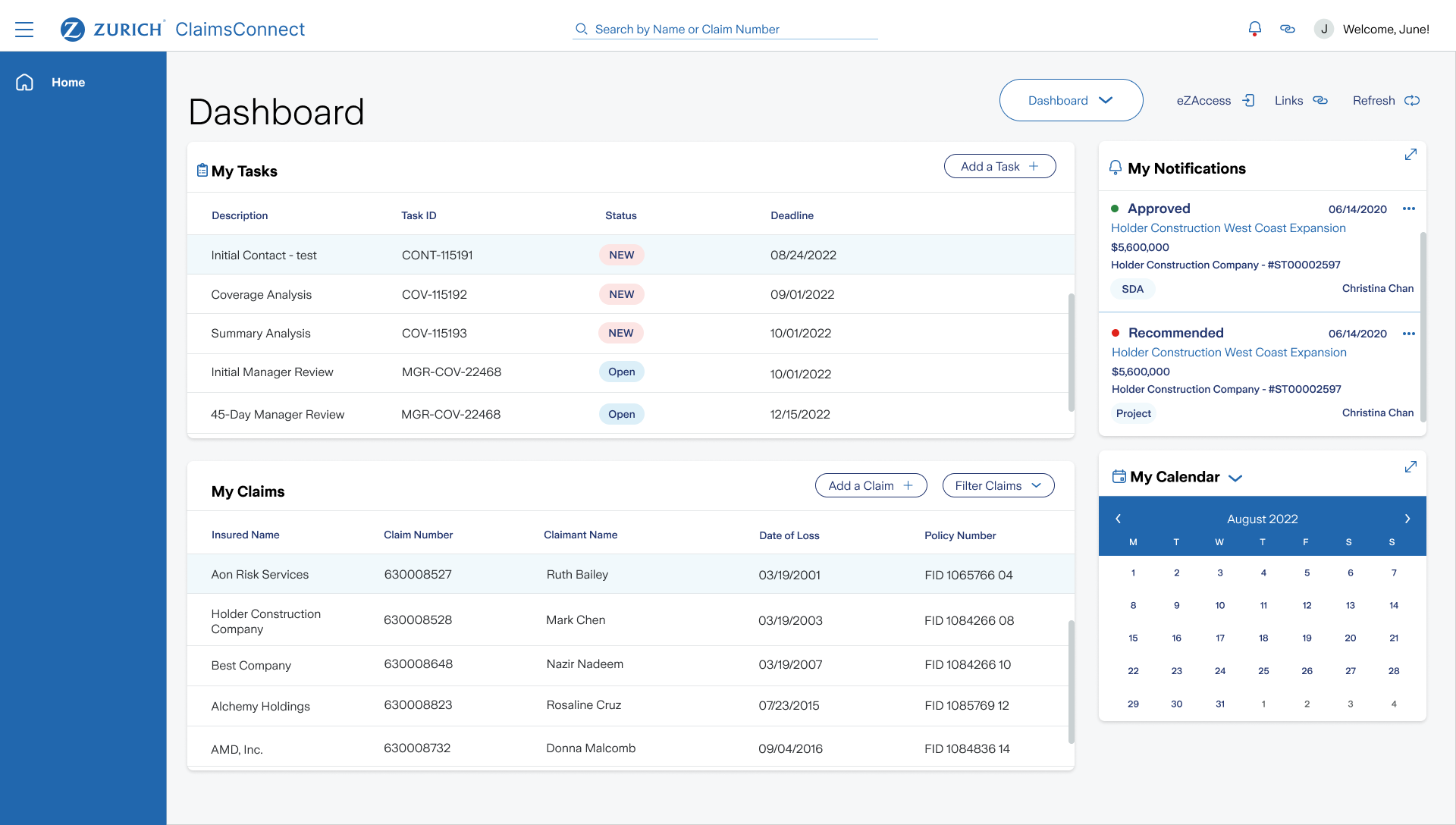
The scope of work focused on understanding user pain points and areas that need simplification. I conducted workshops around key areas of the portal, such as the Dashboard experience, Primary Navigation, My Work, My Notifications and Claims Detail screens to identify pain points and areas for simplification.
Breaking down priorities to maximize learnings
Research prioritization: 3 key areas such as:
- Primary Navigation: Take Actions, restructure this area
- My Work: How do I manage my day
- Claims Detail Screen, Tasks List, Claim Summary, Contacts, Notes, Documents
- Stakeholder and User interviews with the Business
- Workshops up to 3 key areas (including UX and key product owners)
- UX Audit at a high-level using best practices
- Gather user insights and feedback to help define UX guiding principles
High level UX needs of the daily user
1. Navigation
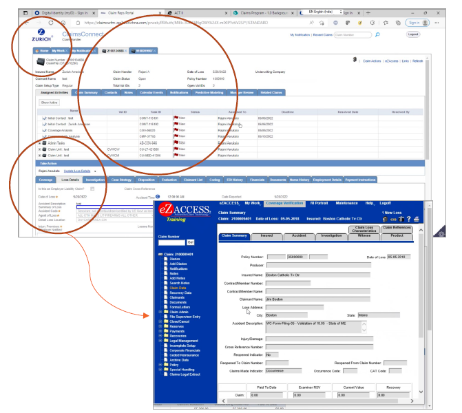
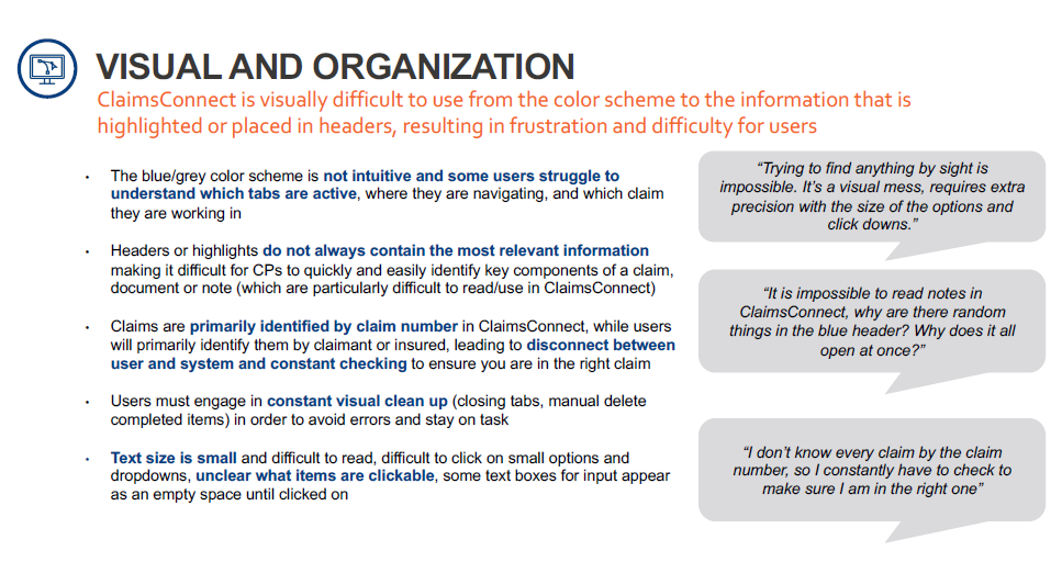
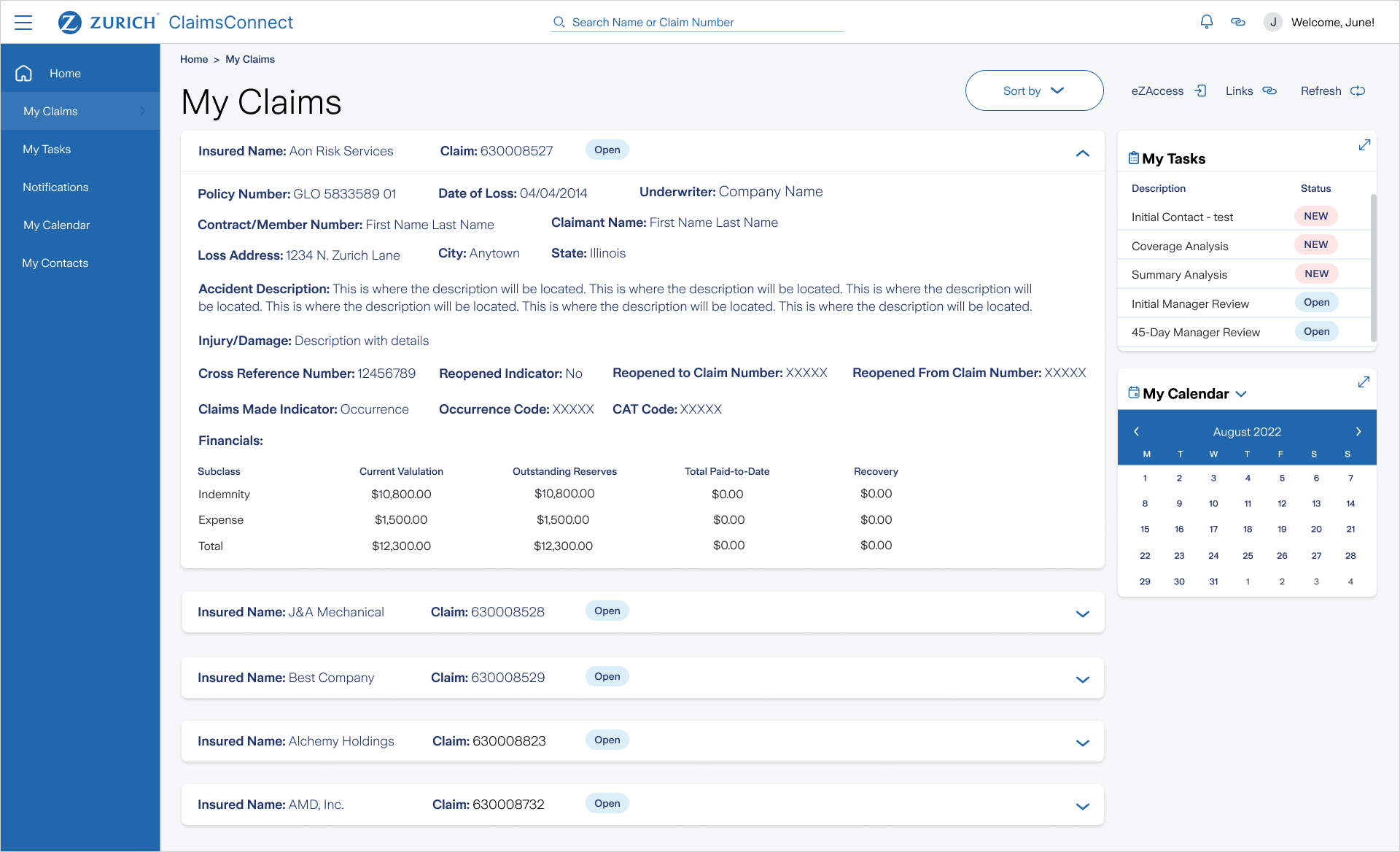
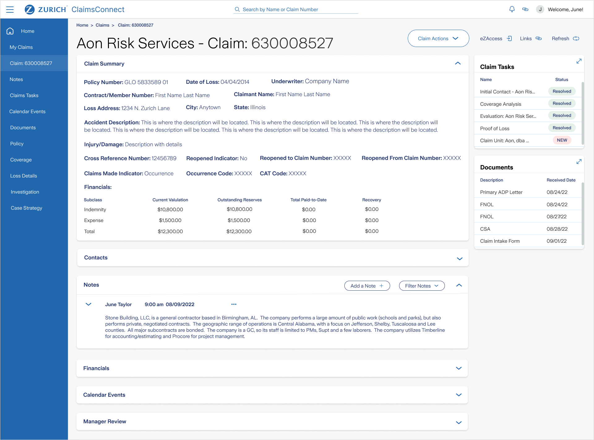
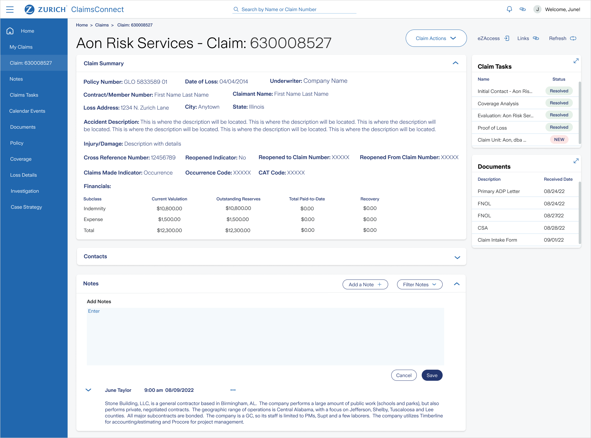
Currently, the experience is tab based when the user gets down to the Claims Detail Screen. This creates what we call “ A Sea of Tabs” and the experience can be very overwhelming seeing all the navigation at once. The navigation needs to reimagined to be a left nav with secondary and tertiary fly-outs. Or perhaps using modules if the page content allows.
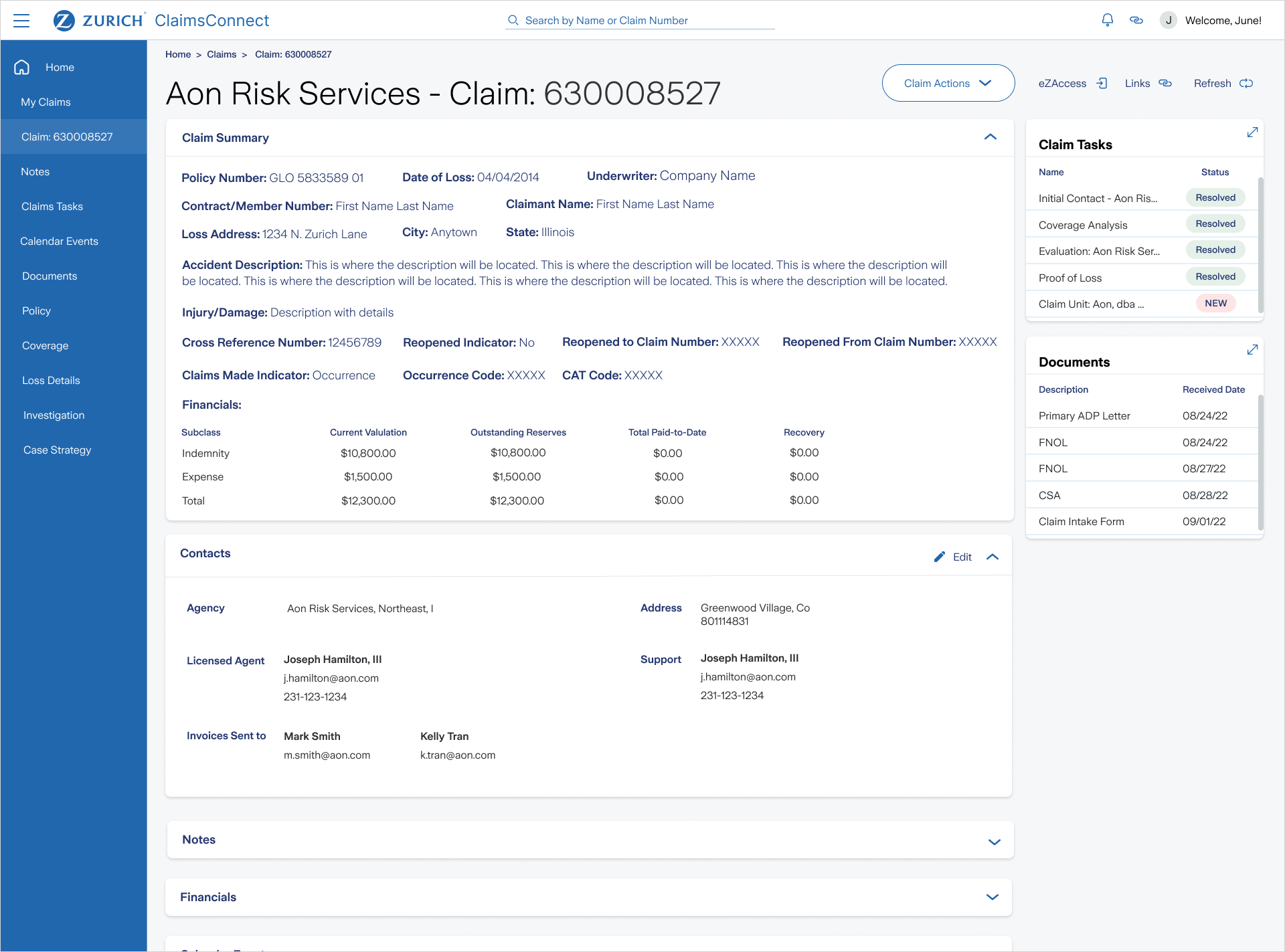
2. Claims Details Screen Our Users
(CP’s – Claims Professionals), work on multiple claims at a time. They sometimes use EZ Access for claim information because the application is more intuitive. We will be conducting interviews with SME’s to learn more about day-to-day Claims Connect user needs, wants and pain points.
3. Take Action
Understand user needs for Take Action section of the portal. We need to understand what makes access information in eZ Access easier and how we can build-in and replicate that user experience in Claims Connect.
Insights from user interviews
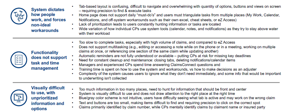
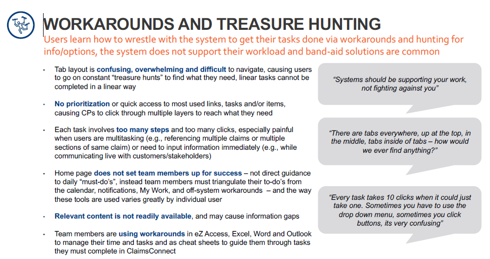
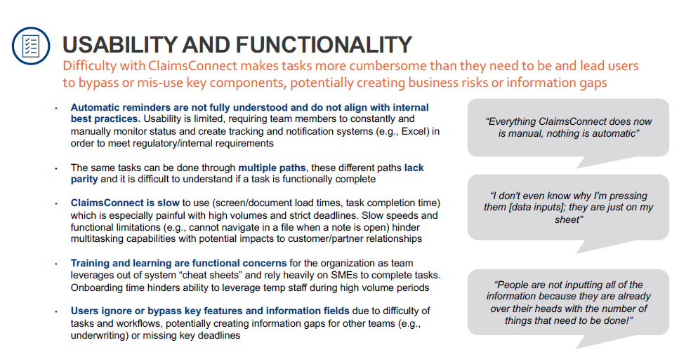
I conducted interviews with 8 ClaimsConnect users to understand needs and pain points and assess overall high-level usability of the ClaimsConnect system. ClaimsConnect includes all content users need to do their jobs, but does not have adequate usability and intuitive support for users to manage their tasks and time without workarounds and idle / lost time
Below is a summary of the findings:
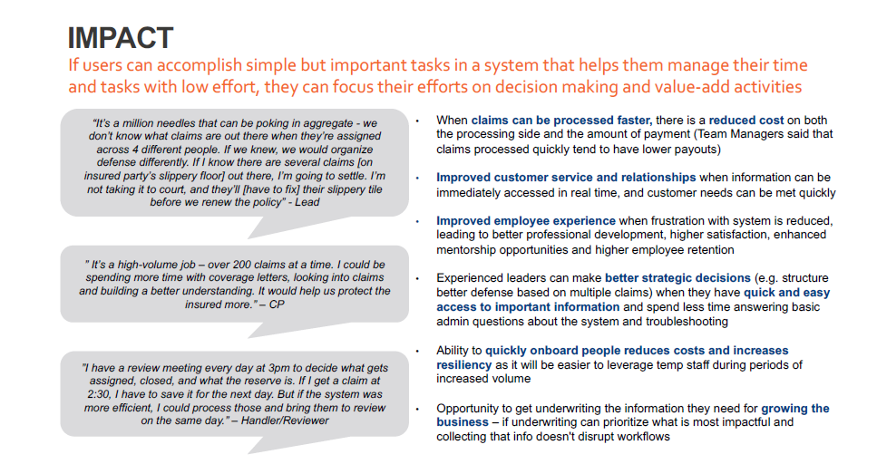
Helping users achieve their goals
The redesign was focused on how people work and allows users to quickly accomplish their most important tasks in the system so they can focus on making impactful decisions. The new strategy:
- Supports how users work (rather than dictate)
- Supports high volume multitasking, time management, and task management
- Understands roles, goals, and workflows of users to ensure usability aligning to their priorities
Prioritize what's important:
- Alerts/notifications for most important/immediate tasks sousers don't need to constantly monitor manually
- Organize info according to what users need to see and they need to see it
- Uses visual cues to reinforce the user has the correct claim open
- Prioritizes what information is needed for underwriting / decision making, avoid additional input
Final thoughts
By focusing on user pain points and implementing targeted solutions, the help desk calls have decreased by 75% in the first 14 days of launching the new dashboard layout.

.png)