Identifying usability issues
Our journey began with a thorough analysis of the existing prospect experience. It became evident that the current setup lacked active promotion and failed to incentivize users to register. With unrestricted access to information, users found little motivation to complete the sign-up process, resulting in low conversion rates.
Unveiling growth opportunities
With a clear understanding of the challenges, our project goals emerged:
- Provide more registration opportunities: I aimed to strategically place resources behind a login firewall, compelling users to register for access
- Enhance registration flow: I simplified the registration process, reducing user burden and improving clarity regarding the benefits of registration
- Deliver an intuitive experience: I aimed to guide users seamlessly through the onboarding journey, making it easier to understand and navigate
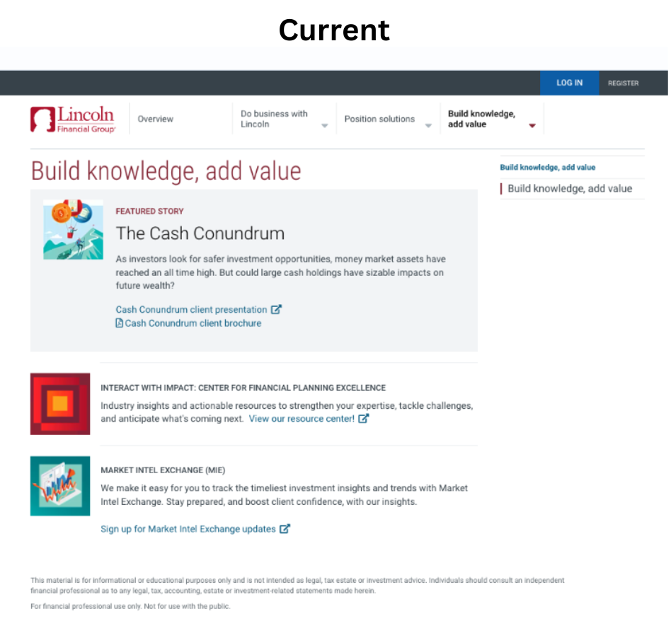
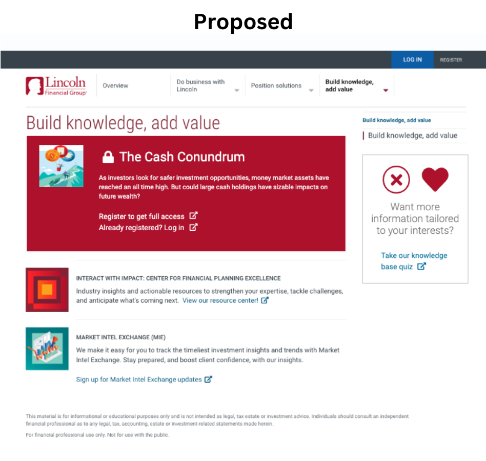
The lack of incentives
The existing user experience lacks incentives for users to engage in the sign-up process. With unrestricted access to all information without requiring registration, users fail to perceive a compelling motivation to complete the sign-up, leading to a low sign up rate.
The public site experience
In order to comprehensively assess the user experience, I conducted an analysis of the entire flow from the first time users are exposed to the resources. This analysis revealed several challenges contributing to low user sign-ups. Users can freely access information on the public site without the necessity to log in or register for the secure experience. Additionally, a lack of incentivization was identified as a key factor in discouraging users from signing up.
Proposed layout details
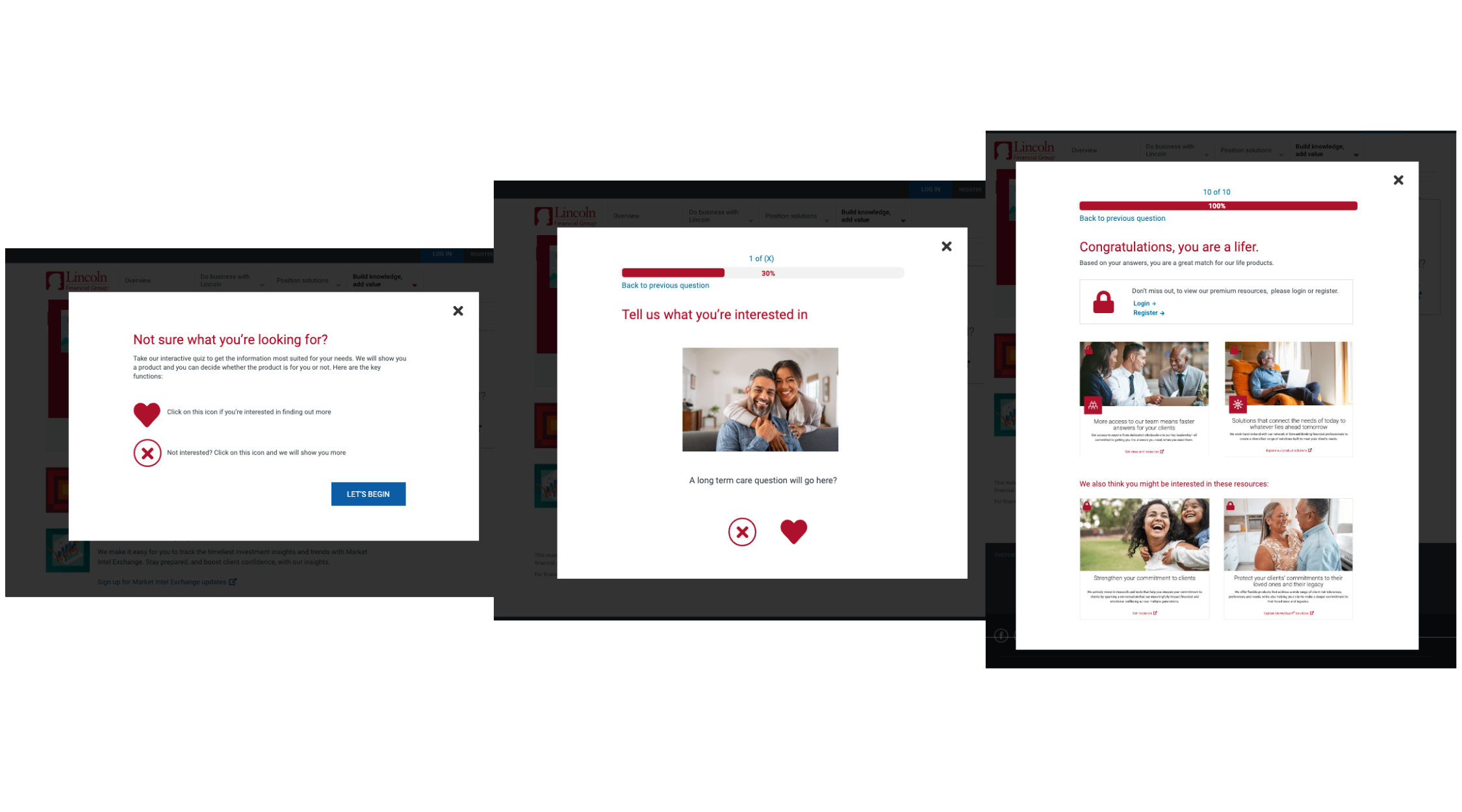
To tackle the lack of incentives, I proposed a layout redesign. Key resources would be gated behind registration, incentivizing users to sign up. Additionally, I envisioned a content curation tool to provide personalized insights and product recommendations, driving conversion rates higher. This tool serves a dual purpose, offering deeper insights into user preferences from a business perspective while simultaneously informing users about available products upon completing the signup process.
Registration
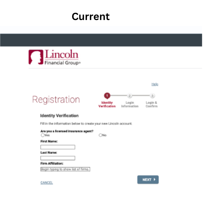
During the evaluation of the registration process, I conducted user testing to gain insights into user perceptions. The findings indicated a widespread sentiment among users that the experience failed to captivate their interest. A notable 95% of users expressed reluctance to proceed with the registration due to the perceived burden of numerous fields and a lack of clarity regarding the benefits.
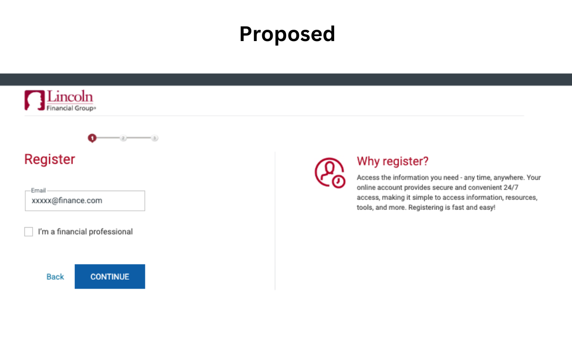
To address this challenge, I recommended a redesigned layout aimed at streamlining the registration process. The proposed solution involves an initial step soliciting only the user's email, followed by a subsequent verification step to confirm the user's financial professional status. The final step entails confirming information and submitting the user's details to the business. This approach aims to simplify the process, making it more user-friendly and enticing, fostering increased user engagement during registration.
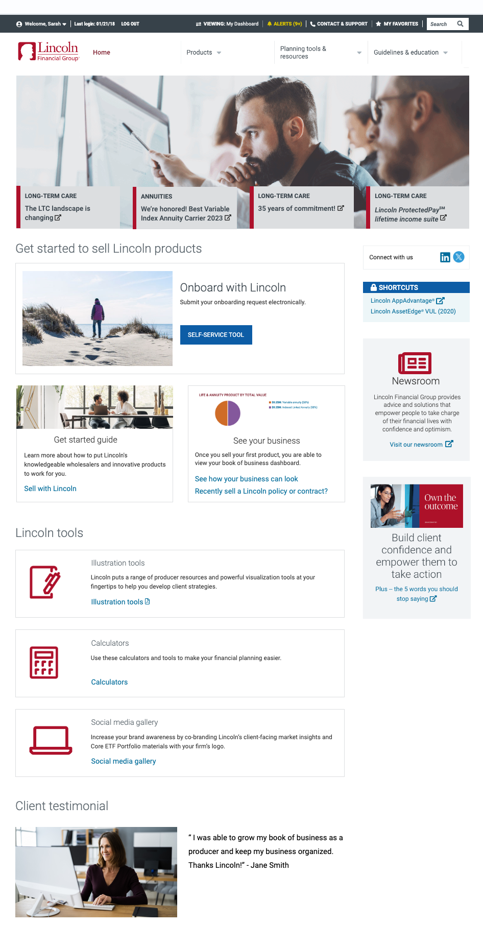
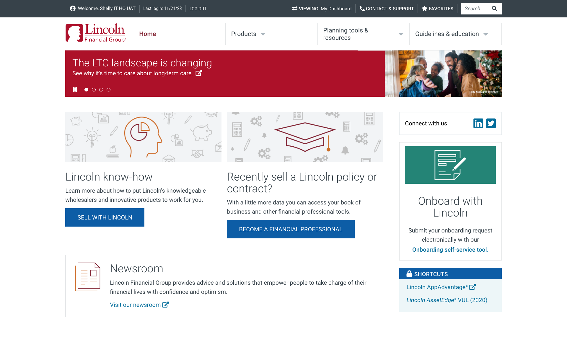
Revamping the prospect landing page
Through comprehensive user testing, insights revealed a notable user challenge in understanding the process of becoming a producer and navigating the step-by-step procedures. To solve for this, a strategic redesign was implemented, breaking down the page into three distinct sections to enhance scannability and user comprehension. The revamped structure includes a section that educated the user with information and resources. This section is followed by a tools section that allows users to access various tools available. The last section includes a real life user testimonial. After completing a usability test on the new proposed layout, user engagement increased by 90%, which confirmed the usability of the proposed layout.

.png)